Designing for transparency in M365 Copilot to improve user trust.
Sources Pane in M365 Copilot
Context
As Microsoft shifted to LLM-powered Copilot, a critical gap emerged: users couldn’t fully see or verify the sources behind AI-generated answers. Trust, completeness, and transparency became essential pillars for adoption at enterprise scale.
The Sources Pane was designed to close this gap; Surfacing cited, uncited, and search-based sources in one structured view, giving users confidence that Copilot’s responses were grounded in real content, not hallucinations.
My role
Lead designer driving strategic clarity, facilitating alignment across design, PM, engineering, and research ensuring the solution could scale across Office apps.
Challenge
Early versions of Copilot relied on inline references hidden in pills or behind “+n” expansions. While this worked in the early days, it quickly failed to scale as the product matured. Users were left asking: Where did this answer come from? What’s missing? Can I trust this?

Early Copilot days circa early 2024
We uncovered three interconnected problems:
1. Lack of Transparency
-
Users couldn’t see the full set of sources Copilot was drawing from.
-
Important uncited materials were invisible, making responses feel incomplete or biased.
-
Users could not see what keywords Copilot had searched for the user's query.
-
If there was something that was excluded by Copilot due to admin policies.
2. Scalability & Consistency
-
Copilot was becoming the AI layer across Microsoft 365 (Word, Excel, PowerPoint, Outlook, Teams, and even Edge). The references model had to work equally well in full-screen docs and narrow sidecar views, adapting gracefully without losing clarity.
-
Memory, token limits, and latency introduced real barriers: surfacing every possible source could slow the experience or overwhelm users.
3. Completeness of response
-
Copilot returned a neat summary but not the full list, leaving users frustrated and forcing them back to traditional search.
-
A top dissatisfaction driver (~30% DSAT) came from scenarios like "show me meetings from next week" or "emails from my manager last week"
We needed to design a source experience that was transparent, complete, and scalable - all while respecting strict performance constraints and aligning with Copilot’s evolving visual language.
Process
We had a clear direction of what we wanted to do. We wanted to design a dedicated space in the Chat experience where the users could see everything Copilot referred to. Sounds simple right? Not really.
Things get tricky here so I will break it into parts. We had 3 main sections to solve for:
-
All the sources Copilot found for the users query
-
The sources which Copilot considered for the response before citing them
-
The sources which were cited in the response
Content cited by Copilot
All content found by Copilot
Content considered by Copilot
An overly simplified diagram of how Copilot filters out content for its response
We explored multiple directions with a clear set of goals, knowing upfront that we might not achieve each one equally. Our priorities were:
-
Simplicity and ease of use — ensuring the sources pane felt lightweight and intuitive, so users could quickly understand what information Copilot was drawing from without added friction.
-
Scalability across contexts — designing an experience that could gracefully adapt to both wide canvases (like Office.com, where Copilot can take center stage) and narrow sidecar surfaces (like Outlook or Teams, where space is constrained but trust and clarity are equally critical).


A few of the explorations we did for each of the two concepts
After several rounds of critique, it became clear that the two-tab design would not scale effectively. A few concerns stood out:
-
Low tab engagement — past research showed that users rarely interact with tabs. Relying on them risked hiding valuable information, making it less likely that users would explore all available sources.
-
Ambiguous labeling — even with careful copy, terms like “More results” versus “Search results” caused confusion; at times even for us as designers. If we weren’t confident in the distinction, it would be unfair to expect users to be.
-
Poor adaptability to narrow canvases — while tabs worked in wider layouts, the structure broke down when adapted to constrained surfaces such as sidecar or compact Copilot views.
We moved forward with the Single List approach, treating it as a V1. This let us get a clear, usable solution into users’ hands quickly, while keeping space for the north-star version into a right-pane experience once framework dependencies aligned. It was a deliberate trade-off. We were balancing for scale.
Before arriving at the final direction, we explored multiple variations to test how the experience. could scale and remain simple. These explorations helped us stress-test assumptions, uncover edge cases, and refine the details that would ultimately shape the V1.

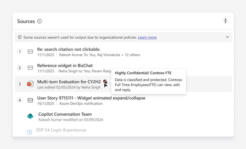
A few details that survived✨
Outcome
Here’s how the V1 came to life to 30M+ users 🥳
Key highlights:
-
The sources widget made Copilot responses transparent and verifiable by surfacing cited, uncited, and search results in one expandable view.
-
By improving visibility and source diversity, it strengthened user trust at scale.
-
Shipped worldwide with no performance regressions, it closed major customer escalations and boosted trust metrics across M365.
Building on the success of the first version, we quickly iterated toward V2 of the References Widget. We moved the experience from inline placement to a dedicated right-side pane, giving users more space to explore sources without cluttering the main chat. This shift not only improved usability but also made the design more scalable - supporting larger sets of sources while adapting seamlessly to narrow canvases like sidecar views as a modal.


